When carrying out an office fit out, choosing colours should be one of the top priorities on your list of considerations. Colours for office fit out stimulate the human brain and create unconscious reactions, so the choice made for your office design will affect the mood of your staff and visitors.
Businesses usually make a conscious decision about colours when designing the brand’s visual identity, including the logo. For this reason, they often choose to match the office’s design to it. However, some businesses have only black and white in the brand’s colour or would like to add extra colours to the office scheme to explore the advantages of a colour pallet or colour combination.
This article will guide you through the colour classifications, meanings, and combinations to help you make the right decision. Moreover, our team is always available for a free consultation to assist in the creation of the perfect office fit out.
Understanding Colours to use in the Office Design
Before deciding the best option for your office design, it is crucial to understand some principles about colour and how it works.
The Basics of Colour

Primary Colours
Red, Blue and Yellow. These colours cannot be made by mixing two colours.

Secondary Colour
Green, Orange, and Purple. They are created by mixing two primary colours. For example, yellow and blue make green.

Tertiary Colours
They are created by mixing primary and secondary colours and adding grey, black or white we change the tint, shade or tone. They represent all the colours that are not in the two groups above.
Colour Theory
Most fields involving the use of colours, such as arts, interior design, and fashion, adopt the colour wheel tool to guide the decision-making process and create harmonic colour combinations. It is a helpful way to organise, display and combine colours.

Warm Colours
Examples are red, oranges and yellows. Note how they seem “strong” in the eyes and associated with elements like the sun and fire.
Cool Colours
On the opposite side of the wheel, we have blue, green and purple, representing the cool colours, generally easier on the eyes and associated with the sea, forest and flowers.
Colour Psychology
Now that we understand the basics, let’s explore the graphic below describing the unconscious reactions to colour and how it can affect us.

The use of colours will assist your business in delivering a message and probably impact staff’s mood, consequently impacting productivity. However, it can be overused, irritate the eyes, or cause undesired reactions. For example, too much red causes anxiety and irritation, while brown can be dull or boring.
We usually use a combination of colours to ensure the office looks nice, comfortable, and elegant. The colour theory, and the wheel, offer us guidance on how to match them.
Colour Combination
The guide below shows which colours harmonise when combined, according to the rules defined. Some designer tools can simulate how it will look and offer the colour code (#), a value used in Html for computers to interpret and display the colours as close as possible to what we see.
At B2B Office Interiors, many office pieces of furniture are customisable, so finding what you need is very possible as we offer a wide range to choose from.

Monochromatic
Created from one single colour, we achieve them by adding grey, black, or white to it. So when designing office interiors, you can choose light blue, aquamarine, and accents of dark blue, for example.
Analogous
It creates a sophisticated ambient and can inspire a powerful message, but because the colours are too similar, it can be overwhelming or overused. The solution is to choose one dominant colour and add the others as details and accents.
Complementary
You can use this combination when designing an office to play with details in the ambience. However, if the colours are too bright, such as red and green, for example, using equal amounts of them can be too hard on the eyes. So instead, you can buy green office chairs and add the red using a picture frame or a vase of flowers on a desk or counter.
Triadic
It creates a bold and versatile colour scheme. The designer commonly chooses one leading colour and uses the remaining two to add details. It can also be used to create a high contrast or to differentiate the space into two areas without using screens or dividers, for example, to add an area of meeting pods inside the open plan office.
Tetradic
This combination is used less often in office interiors because it can be overwhelming. However, applying the same principle of picking one main colour and using the remaining as accents, adding discrete details to the ambient will work brilliantly. Moreover, it suits outdoor projects and places that require a lively atmosphere.
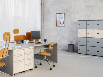
Office Fit Out Projects
Now that we have explored the basics of colours, the combinations and the reactions it proves, we can check some of B2B Office Interior’s fit out projects.
In practice, there are many things to consider during the planning phase, such as the space available, if the room will be only partially renovated, and the number of staff to accommodate, this is why we carry out a consultation to ensure your project is personalised to your office’s needs.
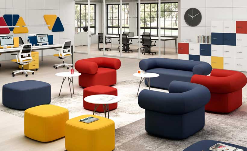
Breakout Area
Green suits a lounge area well and inspires calm, tranquillity and a connection to nature. Yet, it adds a lively atmosphere instead of creating a dull space with only pastel colours.


Canteen
If the canteen and breakout area is used for socialising and staff take a lunch break at similar hours, a colour that inspires sincerity and trust can help communication. In the example below, a colourful background was added to the primary blue theme to match their logo and encourage creativity and warmth.


Boardroom
In a boardroom, a touch of green is a good idea to inspire calmness. Yet, the black chairs and brow boardroom table transmits the authority and importance necessary for the ambience since it is where important decisions are made.


As you can see in most of our projects, combining colours is more common than using a single colour when designing the office. This is because it improves the room’s appearance and allows the use of strong colours without a huge impact on the eye.
Do you need more help?
Choosing the correct colours for your office impact how your staff and visitors will feel. We guided you through using colours and their combinations to help you make the right choice. Yet, if you need professional help, feel free to contact us for a personal and free consultation.